Gotta be blunt and say it burning tux is not cool!
But reality is that I’ve got a little pandemic boredom and the doodle bug. Recently during my upgrade to core update 144 I was doodling ideas of keeping tux safe. And just to be clear, I have no intentions of causing controversy or change; I’m just doodling while using the software I love and having a joke or two around it. Yes, those are jokes about tux…
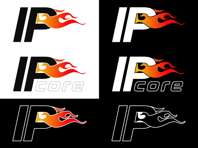
My initial doodles were caricatures of peeing fire (I’m certain it’s your first thought too ), which drifted towards the cliche of a shield on fire, but I ended in the direction of my preferred style “boring”, ie. clean, simple, and obvious.
The white space under the P and flame can be used for a sub brand, e.g. “core”, or a version number, or domain “.org”. Take it or leave it… either way, I’ll keep doodling.
Take the core and replace with fire (same font & same case & same location as core). And then add flames moving upward either behind or above the fire. Good? Bad? Thoughts?
I did not include the word “fire” because I was using implied symbolism with the flame, and at the same time to reduce noise while keeping the logo adaptable. Since the type and mark are interwound it becomes difficult to downscale. “core” was used as a placeholder for sub-branding and it’s also the 1st detail to be dropped when downscaled because it loses recognition.
The flame is flowing horizontally for the flag effect which often represents freedom. It also helps in the reduction of vertical space. And that becomes important with placement within a UI.
As for your suggestions, I tend to agree with the consensus and I will try to doddle around it.
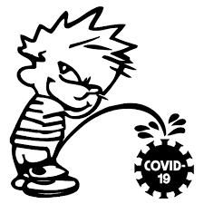
The infamous urinating calvin was definitely my inspiration for the caricature idea.
Next time you look at it, think of a torch and feel its protection. And I will try to post more bad ideas because IPFire doesn’t really need a logo refresh.
I like it. Thanks for sharing your work. Sad to say, but I had never thought of the obvious “I pee fire” bit with the project name. Perhaps remove the flames and insert a hypodermic needle? For the Penicillin shot to clear up the…OK, nevermind, I’ll see myself to the door.
 ), which drifted towards the cliche of a shield on fire, but I ended in the direction of my preferred style “boring”, ie. clean, simple, and obvious.