Have been running IPFrire for a few weeks now (IPFire 2.27 (x86_64) - Core Update 159). Everything works great, Red/Orange/Blue/Green. Was really nice to setup great product.
I have a quistion about the incoming/outgoing traffic graphs, how should one read these? They seem back to front to me…
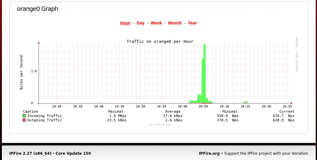
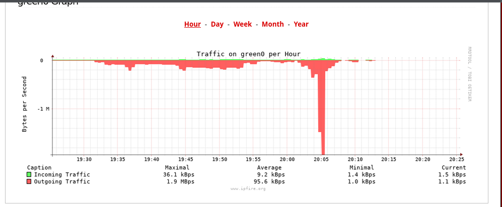
For example I just ran a backup of a server from the Orange Zone to the Green Zone (rsync). So traffic from Orange to Green yet the graphs, the way I read them show Orange traffic as incoming and Green traffic as outgoing? Something wrong with my mind set? Am I mad?
That is right!
I assume data flow was from the server in orange network to client in green network. Then the full flow is server → IPFire → client. The orange NIC on IPFire receives these data and transmits them on the green NIC. Exactly this is documented in the graphs.
I know this problem. It depends on the point of view. Being an user of a network I look at my client, but the graphics focus on IPFire.
Just for completeness.
Thanks all, ok I have to think differently then. The router is only concerned about its interfaces and not the zones themselves… makes sense now I think about it.